Are you looking to understand gold and silver spot price charts but don’t know where to begin?
Many new investors find themselves overwhelmed by the complexity of these charts. However, mastering them is crucial if you want to make informed decisions about buying or selling precious metals.
Spot price charts display the current market value of gold and silver, and learning how to read them can save you from costly mistakes. In this guide, we’ll break down how these charts work, why they’re important, and how you can use them to time your investments for the best returns.
What Are Gold and Silver Spot Prices?
Spot prices are the current prices at which gold or silver can be bought or sold for immediate delivery. Unlike futures or options, which deal with contracts for delivery at a later date, spot prices reflect the real-time value of precious metals.
The spot price chart is a graphical representation of these prices over a period, showing fluctuations based on market demand, geopolitical events, and economic factors. These charts are updated regularly to reflect the market’s ever-changing dynamics.
Why Are Spot Price Charts Important for Investors?
When you invest in precious metals like gold and silver, you’re not just relying on the physical value of the metal, but also on its market price. Spot price charts provide insight into the most recent market trends, helping you to decide the best time to buy or sell.
By understanding these charts, you can make educated predictions about future price movements, which can be invaluable when managing your portfolio or determining the right time to enter or exit the market.
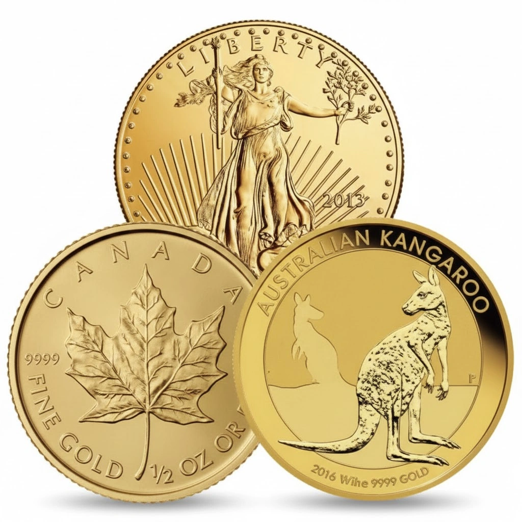
Buy or Sell Gold & Silver Coins with Confidence
Work with a trusted Las Vegas coin dealer offering fair pricing, honest appraisals, and expert guidance every step of the way.
How to Read Gold and Silver Spot Price Charts
- Understanding the Basics of the Chart
Spot price charts usually display prices on the vertical (Y) axis and time on the horizontal (X) axis. Here’s a basic breakdown of how to read them:
- Y-Axis: The price of gold or silver per ounce.
- X-Axis: The time period, typically represented in days, weeks, months, or years.
- Chart Type: The most common chart types are line charts, candlestick charts, and bar charts.
Example:
If the chart shows that the price of gold on the Y-axis is $1,800, and the X-axis indicates the last week, you’ll know that gold was valued at $1,800 an ounce during that time frame.
Pro Tip: Always look for long-term trends (bullish or bearish) rather than making decisions based on short-term fluctuations.
- Recognizing Candlestick Patterns
Candlestick charts are often used because they offer more information than a simple line chart. Each candlestick shows the open, high, low, and close prices for a specific time period.
- Bullish candlestick: A candlestick with a body that’s colored green or white, indicating that the closing price is higher than the opening price.
- Bearish candlestick: A candlestick with a red or black body, showing that the closing price is lower than the opening price.
Understanding these patterns can help you identify potential price trends and price reversals.
Real-World Example:
A doji pattern, a candlestick with a small body and long shadows, signals market indecision and could indicate a price reversal.
- Analyzing Price Trends and Movements
Gold and silver spot price charts tend to show consistent patterns of price movements. Understanding these patterns can give you an edge in predicting market trends:
- Uptrend: A series of higher highs and higher lows, suggesting increasing demand and rising prices.
- Downtrend: A series of lower highs and lower lows, suggesting falling prices.
- Sideways/Flat Trend: When the price moves within a narrow range, indicating indecision in the market.
Case Study:
In 2020, gold prices saw a massive uptrend due to the economic uncertainty caused by the COVID-19 pandemic. By following the trend on the chart, many investors made significant profits by buying during the dip and selling during the peak.
- Identifying Key Support and Resistance Levels
Support and resistance levels are key price points at which the market tends to reverse direction.
- Support level: A price point where the demand for gold or silver is strong enough to stop the price from falling further.
- Resistance level: A price point where selling pressure is strong enough to stop the price from rising further.
Pro Tip: When the price approaches these levels, pay close attention to whether it breaks through (indicating a strong trend) or reverses (indicating a potential market correction).
- Timing Your Investments: When to Buy and Sell
Knowing when to buy or sell is crucial for maximizing profits. Here are some actionable tips for timing your investments based on spot price charts:
- Buy when the price is at a support level: This is usually when the market is undervalued, and demand is likely to increase.
- Sell when the price is at a resistance level: This is typically when the market is overbought, and prices may soon fall.
- Watch for breakout patterns: If the price breaks through a key resistance level, it may signal the start of an uptrend. Similarly, if it breaks a support level, a downtrend may follow.
Example:
In 2016, silver broke through its resistance level of $20/ounce, signaling a bullish trend. Investors who bought at or near the breakout point saw significant returns.
Pro Tips for Beginners
- Avoid chasing the market: It’s tempting to buy when the price is rising, but buying at the top can lead to losses. Instead, wait for pullbacks and support levels.
- Use technical analysis alongside other factors: Don’t rely solely on spot price charts. Consider market news, inflation rates, and geopolitical factors.
- Practice with demo accounts: Many trading platforms offer demo accounts where you can practice reading spot price charts without risking real money.
FAQ
1. What does a gold value graph show?
A gold value graph displays the current market valuation of gold and illustrates price movements over time. It provides investors with a visual reference for tracking fluctuations and spotting historical trends in the precious metals market.
2. How can I interpret silver pricing charts?
Silver pricing charts function similarly to gold charts, with price typically on the vertical axis and time on the horizontal axis. Observing patterns, trendlines, and areas of support and resistance can help guide strategic buying and selling decisions.
3. Which type of chart is best for beginners?
For those new to precious metals investing, a simple line chart is easiest to follow. Candlestick charts offer more detailed insights into daily price action but may be more complex for initial analysis.
4. Can these charts forecast future price movements?
Historical price graphs can reveal past trends, but forecasting future prices requires combining technical analysis with market fundamentals, geopolitical developments, and economic indicators.
5. How frequently are gold and silver prices updated?
Precious metals prices are updated continuously throughout trading hours, often every few minutes, reflecting real-time market conditions and investor activity.
Conclusion
Reading gold and silver spot price charts doesn’t have to be complicated. By understanding the basics of price movements, recognizing chart patterns, and using tools like support and resistance levels, you can become a more confident investor in the precious metals market.
Now that you know how to read these charts, you can start making informed decisions on when to buy and sell, helping you maximize your investments in gold and silver.